Google’s AdWords platform is the most powerful, effective advertising platform ever. Entire businesses rise and fall based on their ability to optimize customer acquisition costs through AdWords. AdWords is especially powerful when visitors can buy right away.
If you sell consulting services, complex technical solutions, construction services, legal services, and other services that buyers can’t simply “add to cart”, your website has one job: lead generation. Nothing else matters. Not your fancy design, or nice color scheme, or amazing company history, or your breathless verbiage about how awesome your services are. What counts is generating leads. To grow beyond word-of-mouth, you need your website to give you leads. Yet most B2B websites tend to be pretty bad at doing their job.
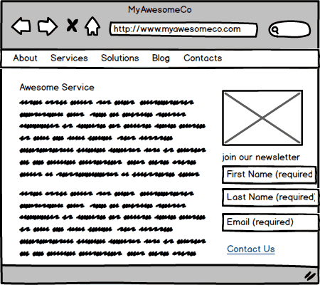
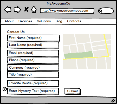
If your website looks like the example below, with giant walls of text and a sadistic “Contact Us” page, the good news is that you’re not alone, and with a few easy tweaks, you can make your website work much harder for you.
This sample service page, based on countless real-world website, is not friendly to visitors. As they scan the page, it’s overwhelming—with a giant wall of text, filled with lots of buzzwords. There’s a signup form for the newsletter, which is not clearly related to the page. (Why not put that on the blog?) Intrepid visitors may make it to the link to the Contact Us page, but most will just use the back button. (How painful is this to read on a phone?)
The contact page has a big form, asking for information that would be really, really helpful for marketing if only people wanted to fill it out (“we totally need to optimize our follow up funnel based on prospects’ favorite Beatle”). But visitors don’t want to give this much information, so most of them, even the ones who have made it this far, decide not to fill it out. Or they enter bogus information that makes the marketing reports unreliable, anyway. Are you really getting so many leads that you need to make people enter a fuzzy set of random letters and numbers (otherwise known as a “captcha”) to even submit the form?
You’ve made visitors jump through several hoops to even get to the page where they have to jump through more hoops to contact you. This has a bad effect on your conversion rates, which slows your growth, and costs you a lot of money in other business development spending (or even direct web spending, if you’re using paid ads to drive traffic).
This would be like running ads in a newspaper and having your store closed exactly when the ad said to come. That would make no sense, but it happens all the time online.
Want to get more leads (and conversations) from your ads? Get details of what you can do…


