The job of your website is simple: to get leads. But how do you convert visitors to leads (and leads to conversations)?
You present a Call to Action (CTA), so the visitor can take a natural next step.
That CTA is often an invitation to schedule a conversation or subscribe to a newsletter, but a more compelling CTA will typically offer content that helps the visitor solve an important problem, also known as a “Lead Magnet”.
This sounds wonderful and not too complicated, in theory, but a lot of independent consultant websites don’t do this very well. As a result, the site doesn’t do its job, so the consultant gets frustrated and underinvests in the website, and the vicious cycle continues. Or so I’m told.
Here are the big mistakes that prevent your consulting website from converting for you, and what you can do about them.
Here are the biggest mistakes…
Independent Consultant Website CTA Mistakes
Not having a website
If you’re so established and you’re working more for fun than necessity, fine.
Otherwise, you need a website. Some consultants think that since no one buys consulting services online, you don’t need an online presence. Even if your work is through referrals, those referrals will want to go check out your website. Social media is great, but you don’t control it. Let your website do some of the work for you. Otherwise, if you decide that “it’s all word-of-mouth” anyway, you create a self-fulfilling prophecy.
You should have a website, and its job is to get you leads. Not clients, just leads (that you can turn into conversations and clients).
If for some reason you don’t have a website, you don’t have to spend thousands of dollars on a web designer. Get a WordPress template like this one (or SquareSpace, as long as it’s not Wix).
Note that even if you don’t have a website, or you’re having trouble updating your website because your site admin is unreachable in Fiji, you can use Lead Links from social media, your email signature, etc, to offer a great CTA for your ideal prospects.
Your site is too generic
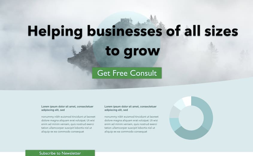
A lot of consultants have generic “motherhood and apple pie” websites with boring jargon, stock images, “About Us” pages about only one person.
Your visitors will make a quick judgement about whether your site is “for them”. Make sure they can tell immediately. There’s a natural tendency to not want to drive anyone away, but that’s a trap. Weak fits or bad fits eat up your time and take you away from great prospects and great clients. You want to send those folks who aren’t the right fit elsewhere. (Bonus points if they consider your perspective “crazy”.)
Don’t look like this:

By trying to appeal to everyone, it appeals to no one. It’s like asking if you want to eat at the Food Restaurant.
Technical issues
If your site takes more than a second to load (at least to be readable), you’re going to lose visitors’ attention.
If your site isn’t “responsive” (responds to different screen sizes, from phones to desktops, with appropriate layout and formatting), you’re going to have problems.
Fortunately, it’s easy to run your site on a fast host (this one is on WPEngine, here in Austin). Use appropriately sized images to avoid the largest cause of page bloat. No point in having a 2 megabyte image that you’re only going to show at a size that could be fine with a 100KB file. And almost all modern templates handle responsiveness to different screen sizes.
Not having a Call to Action (CTA)
Having a website is a critical first step, but if there’s nothing for the visitor to do, other than validate that you seem to exist, it’s going to be hard for them to become a lead, let alone a client.
Seems pretty obvious, but some “shingle” sites don’t have a CTA, or they have the next problem…
Hiding the CTA
Some sites makes you scroll to the bottom to get to a CTA. Don’t make visitors wade through lots of content to take action. If they want to take action after consuming a lot of your content, that’s wonderful, but they should be able to take action without all that effort— otherwise you’ll find a lot of visitors bouncing off our site before they even see your CTA.
Only targeting visitors who already know, like, and trust you
You see this on a lot of sites— prominent calls to “Schedule a Call” or “Subscribe to Newsletter”. There’s nothing wrong with those CTAs per se, but if they are the only CTAs on your site, you aren’t attracting the majority of visitors who don’t know, like, and/or trust you enough yet to want do either of those things. People come to your site to solve a problem— meet them where they are.
When someone is trying to solve a problem, they’re looking for a path from where they are to where they need to go. Give them a road, instead of asking them to make a leap.

Your main CTA should appeal to an ideal prospect who may not already know, like or trust you, but wants to solve the problem you help them solve. It’s on the direct path for them.
This is yet another reason why understanding your ideal client is so important.
If you’re a soccer player trying to get back on the field, a CTA for knee rehab for soccer players is much more powerful than a CTA for strengthen knees, let alone “get healthy”. And if you’re an old lady who just got a knee replacement, the soccer players CTA won’t appeal to you at all. This is a good thing.
If you’re not dialed in to your target audience, use the positioning tool in Mimiran to help you, including giving you ideas for appealing to that audience and inspiring them to action with a CTA.

CTA doesn’t align with page content
Make sure your CTA matches the page it’s on, like a natural stepping stone.
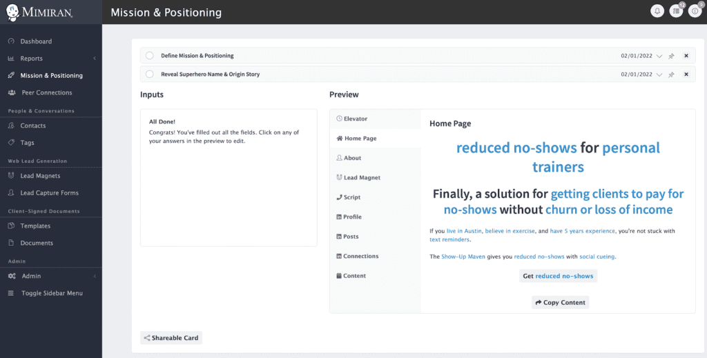
In the example in the image above, someone is trying to work with personal trainers to reduce no-shows. The CTA of “Get Reduced No-Shows” makes a lot of sense. Something like “help your clients get fitter” would not.
You often see this when someone doesn’t have a Lead Magnet of their own, and is repurposing content from elsewhere, like a coach who helps people deal with leadership training offering a generic personality assessment as a CTA. (Note that this assessment might make a great CTA on a blog post devoted to how personality impacts leadership styles and decisions.)
The great thing about the web is that you can surmise that if someone is on a certain page, they are interested in that topic, and might be interested in digging deeper into it.
Being pushy
We’ve all been on sites that bombard us with pop-ups the moment we arrive.
I’m sure many of those sites have done A/B testing and figured out that they get more leads that way. You can test this on your site, if you like.
But what does it say to your ideal prospects? You’re a helpful professional, like a great doctor, not someone pushing pills.
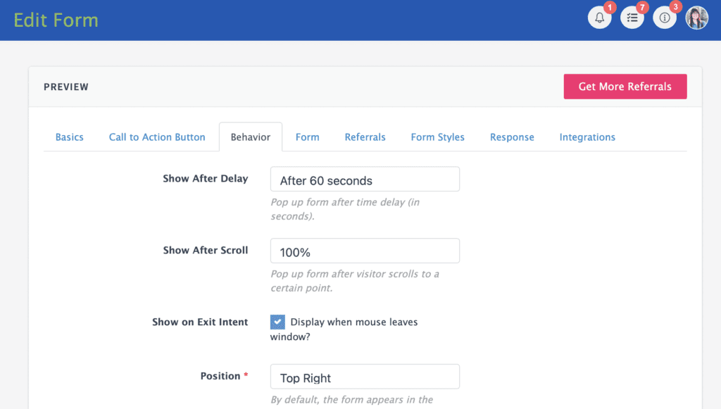
Of course, the line between “pushy” and “helpful” is different for different people. Some people might appreciate a prompt to get some extra helpful information, positioned politely, say in the lower right corner after reading a long blog post.

Note how you can control if and when to activate the prompt without the visitor actually clicking the CTA button.
Not having CTAs on enough pages
Of course you want to put a CTA on your home page, but where else?
Ideally, on every page.
Of course, that may not be realistic, at least in the near term.
So make sure you have CTAs on your high traffic pages, including:
- Main service page(s)
- About Me page
- Thank you page where visitors go after requesting a high level lead magnet. This is a great place to put a short video and an invitation to schedule a call.
- Your most popular blog posts. Consult Google Analytics to see which pages are most popular and add an appropriate CTA at the bottom of each. For example, I have lots and lots of blog posts about proposals, but a handful get the vast majority of traffic. By adding a CTA to get a proposal template at the bottom of these pages, I’ve increased leads without doing a ton of work.
Not offering enough value
If you’re doing all these things above and not getting conversions, ask yourself, or better yet, someone else, ideally someone in your ideal prospect profile, if your CTA is compelling.
The biggest issue, assuming your offer aligns with your page content and ideal prospect’s needs, is that you are holding back value.
Don’t be scared of sharing your genius.
Might some people click your CTA, grab your lead magnet, and do it all themselves? Sure, it’s possible. Those people aren’t actually good prospects. Imagine a surgeon sharing a step-by-step guide to knee surgery and worrying that patients will start doing their own surgeries.
When you share your genius and your passion, you can start to connect with people. (Bonus tip: embed video in your lead magnets to provide more insight into you as a person.)
Asking for too much information
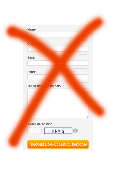
Ever seen a form like this, with lots of required fields, and a puzzle you have to solve?

I’m not a fan. You’re not running a credit report. You’re sending some content. Let your positioning do most of the work of weeding out people who shouldn’t be talking to you.
I almost always just ask for email (so I can send a link to the Lead Magnet) and an optional phone number. Between the email address and the approximate location I get in the notification email, I can usually find a LinkedIn profile with the rest of the information. I’d rather spend a minute doing that, and get more leads, than ask for everything up front and get fewer leads.
Note that people who really don’t want to share information will give you bad info and a temporary email addresses, anyway.
I’ve been very pleasantly surprised by how many people are happy to leave a phone number, which leads to the next issue…
Not following up
We love the notion that prospects will click our CTA and love our Lead Magnet so much that they call us. And this happens. Rarely. Because that’s still a big leap.
The beauty of the CTA converting a visitor into a lead is that you not only have the email of someone who is interested in solving the problem you help them solve, but you have a great opportunity to discuss this problem with them.
So follow up and call, if they leave a phone number.
You don’t have to “sell” or “close” or do anything icky. You just talk about the problem. For example, when people grab a proposal template lead magnet from my site, I ask what they think of it, how it compares to their current template, what they like and don’t like about writing proposals, etc. All the things they want to talk about and are happy to get some advice on.
Next Steps
If you’ve got a Mimiran account, make sure you dial in your mission and positioning, create a compelling lead magnet and a Lead Capture Form and that will take care of your CTA when you put it on your site. Then make sure you take advantage of those notifications to follow up.
If not, start a free trial, or grab your Consulting Website Success Checklist to learn how to get more leads without spending a ton of time and money.
