Although we all want to sell more easily, sometimes our website keeps buyers away, acting more like a fortress than a marketplace.
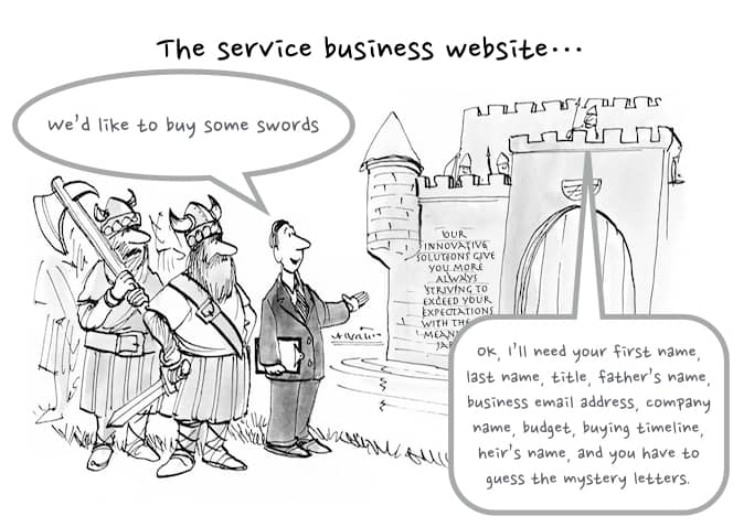
Are you making it hard for your customers to buy by keeping prospects away? No, you might insist, I do everything I can to help prospects and to offer my services. I make it really easy to buy. Just like the guys guarding the castle.
If you’re like me, you’ll still insist that you don’t do silly things like that– you love web visitors and want to make it easy for them to buy. If your website is converting lots of business, you can stop reading now. If you’re in the situation that all your business comes from word-of-mouth or referrals, and your website is just there to prove your company exists, read on.
The need for more leads is the number one issue I hear from owners of consulting and other services firms. This isn’t just about growing faster, it’s also about keeping your pipeline full while you’re focused on delivery, so you can avoid feast-or-famine cycles.
You’d think that given this challenge, services websites would be awesome at converting visitors to leads. But most of them aren’t– they are actually terrible at it. Mine was, when I was running a boutique consulting firm and being really stupidly proud that all my business came from referrals.
What’s going on, and why the cartoon of the castle? When I automated the proposal process for my early customers, some of them came back and said, “great, that’s no longer a bottleneck. Now I want to write more proposals. How do I get more leads?” I looked at their websites, and I had an awful sinking feeling. Because their sites looked a lot like my old consulting website.
Visitors would arrive and see a giant wall of text full of meaningless jargon about how awesome, innovative, and client-centric our methodologies were. Then, if they were really desperate, they could fill out a big, unfriendly form that asked for way too much information, so nobody filled it out. It didn’t display well on mobile (some websites still have this problem, which Google does not appreciate any more than your visitors!).
These aren’t knights who might sack your castle. They are prospects. Just let them come in and learn more about the swords. (You don’t have to give away your sword-making secrets, give away your swords for free, or anything else that could compromise your business. Just tell your prospects about your swords.)
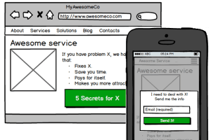
Something like this:

It displays well on all devices, lets you keep your pages nice and simple, and provides a friendly Call to Action designed to peak the interest of someone visiting that specific page. The visitor only sees the button, not the form, which is a much better invitation. Only after they click does a small form pop up right on that page.
In other words, make it easy for visitors to take the next step and become leads. Don’t keep them on the other side of the moat.
You could hook up something yourself, or, grab some info below to see how easy it is to set up a lead capture system like this.


2 Comments
Off to See the Wizard: Do you hate talking to prospects? - Mimiran
[…] When prospects visit your site and ask you to engage with them, do you make it hard? Do you act like you hate talking to prospects? (If you haven’t seen it, yet, you may want to check the last post on whether you are unintentionally fortifying your website against your prospects.) […]
12 Secrets of Successful Sales Conversations - Mimiran
[…] a meeting scheduled with your prospect. (If you missed them, you might want to read about how to get more people to convert on your site, and when to call them to get an initial conversation.) I used to rely on prospects who really […]